This article will help you decide on the right color scheme, whether starting from scratch with your new site’s brand or rethinking the colors on your existing site. We’ll talk about the best color options for websites and assist you in selecting the one that fits the style and personality of your site.
Color is a big part of branding, after all. Have you ever realized that almost all fast-food restaurant logos use red and yellow? Together, these things make people hungry and friendly.
Orange tends to mean fun and friendliness, blue tends to mean dependability, green tends to mean nature and freshness, and black tends to mean luxury or elegance.
So, what would you like people to think of your brand? Read on to find out the best colors for websites and which ones users should use to build their brand’s personality.
As we’ve previously said, seeing certain colors can make you feel a certain way. There is a lot to color psychology.
You might not think colors affect you, but you’d be amazed to see how choosing the right colors can affect a company’s bottom line. In fact, about 85% of people said that color is a very important factor in what they buy.
When some companies changed the colors of their buttons, they saw a sharp increase or decrease in conversions. For example, Beamax, which makes projection screens, saw a huge 53.1% increase in clicks on red links compared to blue links.
And it’s not just clicks—a study on how colors affect people’s minds found that colors increase brand recognition by an estimate of 80%. When you think of Coca-Cola, for example, you probably picture their bright red cans.
This doesn’t imply that the color red is king, though, because there’s no firm rule for this. If your site is mostly red, then a red call to action won’t stand out as much, so you’ll need to try out different colors until you find one that works.
Primary, Secondary, and Tertiary Colors
To begin, you must grasp primary, secondary, and tertiary colors.
- Primary colors are those that cannot be created by combining two other colors. The primary hues are red, yellow, and blue.
- Mixing two main colors yields secondary colors. For example, if you combine blue and yellow (two main colors), you get green (which is a secondary color).
- Tertiary colors are generated by combining primary and secondary colors that are adjacent to each other on the color wheel. These result in compound colors; for example, combining the primary color blue and the secondary color violet results in blue-violet (tertiary).
Why Colors are Vital for a Website
They Enhance Your Appearance
Typically, your color scheme is a crucial decision you must make because it becomes your visual identity. Visitors and potential customers will remember your brand if they can recognize it.
Since different user personas will be drawn to distinct color palettes, this type of visual identity becomes a tool for you and a means to communicate with your target audience. Because color schemes convey so much about your brand, they greatly influence how users feel. Whether you use an analogous color scheme or a monochromatic color scheme, the details matter if you would get the desired effect.
People Notice Them Right Away
Web designers are aware that one of the questions that are frequently considered while designing (and redesigning) a website is, “What type of impression will the design make on my site visitors?”
One of the most crucial aspects of a website’s color design is creating a positive initial impression. This is accurate, and according to a 2018 survey, 94% of respondents claimed that a website’s design influences their initial views of it.
They Promote a Sense of Community
Finally, even if they are unaware of it at first, different color schemes cause people to feel and think about things in a different way. The colors you select will significantly impact the flow and tone of your “conversation,” depending on how you want to address your visitors and audience. We shall discuss color psychology in more detail later on.
Color Pairings
Color pairings are classified into five types: complementary, divided complementary, triads and tetradic, analogous, and monochromatic.
On the color wheel, complementary colors are opposite one another. A complimentary color scheme will include one warm and one cool color. One typical complementing duo is red and green.
Split complementary colors are composed of a base color & two colors that are usually adjacent to the base color’s complement.
Colors in triads and tetrads have similar associations. Colors that are equally spaced on the color wheel are utilized in triads (such as red, blue, and yellow). Tetradic colors are four colors made up of two complementary pairs (such as red, green, blue, and orange).
On the color wheel, analogous colors are next to each other. As a result, analogous colors, such as green and yellow-green, are quite similar.
Finally, monochromatic colors are only different shades of the same color. This is achieved through the use of tints, hues, and tones.
Consider these color combinations to be your tools. You won’t have to worry about your colors clashing because they all work.
Now that you understand the specific combinations you can utilize, consider how to combine them to create a dynamic, compelling color scheme.
How to Choose a Color Scheme for Your Website
How do you discover one that can work for you? Now that you understand how crucial colors are for your website’s brand and user experience let’s look at what you need to do to decide which colors to use.
First, You Need to Know a Lot About What You’re Selling or Giving
People think of high quality, royalty, and intrigue when they see purple, so it’s a good color to use if you want to look more high-end.
But if you want to reach more people, blue is a calming, soft color that works well with sensitive topics like health care or finances.
Pick a “Primary” Color
The best way to choose a primary color is to imagine how your product or service makes people feel and then look at colors that match that feeling until you find one you like. Here are just a few:
- Red: For example, Coca-Cola or Nintendo – Denotes joy or enthusiasm
- Orange: For example, Nickelodeon or Fanta – A cheerful, enjoyable time is in store.
- Yellow: For example, Nikon or McDonald’s – Signals joy and optimism
- Green: For example, Whole Foods or Animal Planet – Connotes freshness and nature
- Blue: For example, American Express or Walmart – Signals dependability and assurance
- Purple: For example, Hallmark or Cadbury – Represents a prestigious brand with a track record of excellence
- Brown: For example, UPS or Nespresso – Suggests a dependable product that everybody can utilize.
- Black: For example, Chanel or Adidas – Denotes refinement or luxury
- White: For example, Nike or Apple – Suggests svelte, usable products
It makes sense to have to use a primary color that goes with your current branding if your company currently has a colorful logo. Nintendo’s webpage makes clear that its branding is quite red.
Nintendo Color
This is probably the simplest stage because you’ll already know what color you like your site to have. Simply remember to save the hex code!
Select Your Additional Colors
Once you’ve decided on a primary color, it’s time to select the other colors you’ll be using. Consider color complements as a good initial stage or starting point. Every color has that complementary color that makes it “pop,” and these are referred to as color complements.
For example, a red circle on a green background stands out more than a blue circle would on a green background. However, a blue circle will stand out on an orange background.
So, if you have a mostly green website, add red calls to action or emphasize essential aspects that you would like to capture the attention of any viewers.
Try to keep your secondary color to one or two colors. More than that, and you’ll be battling clutter. Nothing is going to stand out if you bombard visitors with a variety of stimuli.
Eargo Color

Eargo, a hearing aid brand, is a nice example of using more colors. Its primary color is orange, so this duller blue is selected to emphasize this key portion of its website.
Based on what we know concerning color complements, we recognize how blue and vivid orange contrast. The orange also draws attention to crucial aspects such as the “add to cart” button and the logo.
The use of a color wheel can help you identify colors that complement one another. The complementary colors are opposite each other, while the three primary colors are located at the triangle points.
Select a Background Color
This is an important consideration because the background of your website will theoretically take up more space compared to any other color. However, it’s a simple decision to make because there are only two possibilities.
Use a more muted version of the dominant color to strengthen your branding. In order for the text to appear, a grey or white overlay on the background will be required.
Alternatively, the more common option is to make the entire website an off-white color. It’s not offensive and won’t prevent anything from flying off the screen, including text, images, and links.
Select a Typeface Color
The last step in your colorful trip is to choose a typeface color. You might go with the obvious choice of black, but a quick online search will reveal that totally black typefaces aren’t as widespread as you might expect.
Because there is a 100% contrast, a black typeface on a white backdrop might cause eye strain – and consumers are more inclined to click elsewhere if your website is challenging to see.
While overtly colored typefaces should just be kept for links and vital content, you can use grey or grey-tinted color to make your website appear softer and more inviting. There isn’t much space for experimenting here, but coloring your writing can add a nice final touch.
The Penguin Font
A quick glance at a page on the Penguin Books website reveals that they’ve chosen a softer grey color tone for their writing. This is less harsh than a sharp white and black contrast and allows for a gentler vibe.
Color Schemes for Websites
You should have a good idea of what color scheme your website will use by now. Here are some more pointers to consider while choosing colors.
Make Use of Continuous Saturation
Using different colors with comparable intensities is one way to boost your brand. Saturation is another term for a color’s brightness. Consider the use of color by the beverage manufacturer Innocent:
Innocent Colors
They have six different colors, but none of the colors feel or look out of place. This is because its saturation was muted to the same degree, so it appears uniform.
Use the Same Color but Change the Saturation
When a company has a strong relationship with a specific color, it may not want to stray too far from it. However, having everything be a single color may get boring, so picking your primary color and experimenting with saturation can be interesting. Examine the social media choices at the right-middle corner of this TechCrunch post.
Colors from TechCrunch

They are all a similar shade of green, although with varying degrees of brightness. These add variety to the page’s graphics while also emphasizing the impression that a lighter green color is linked with TechCrunch.
Additional Tips
Resources to Help You Locate and Select Colors
Where do you begin when you’re ready to start looking for colors? When you’re only provided a color wheel, it can be difficult to choose a color. Most of the time, you choose something that appears completely different when it’s put into action. Even if you only like one color, you should look for a palette that complements it.
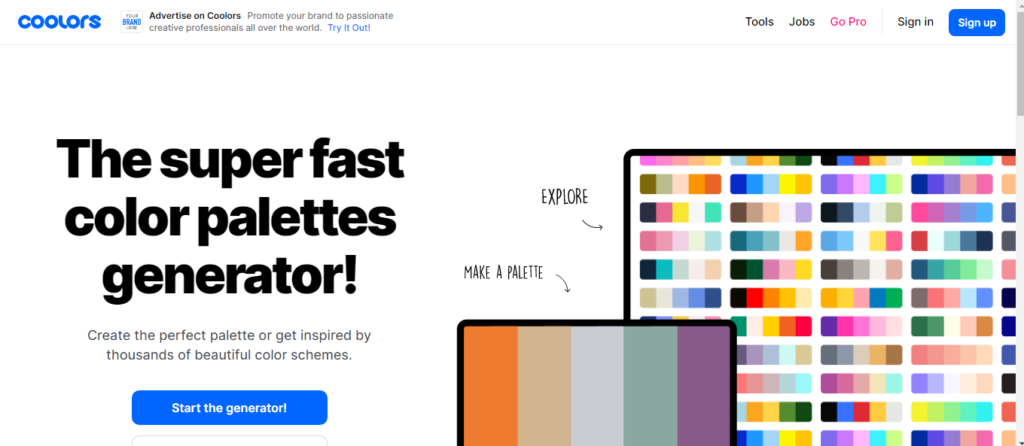
That is why there are specialized tools available to assist you in deciding on a color scheme for your website. Coolors, for example, is a website that allows you to download a pre-made color scheme and integrate it into your website.
Coolors
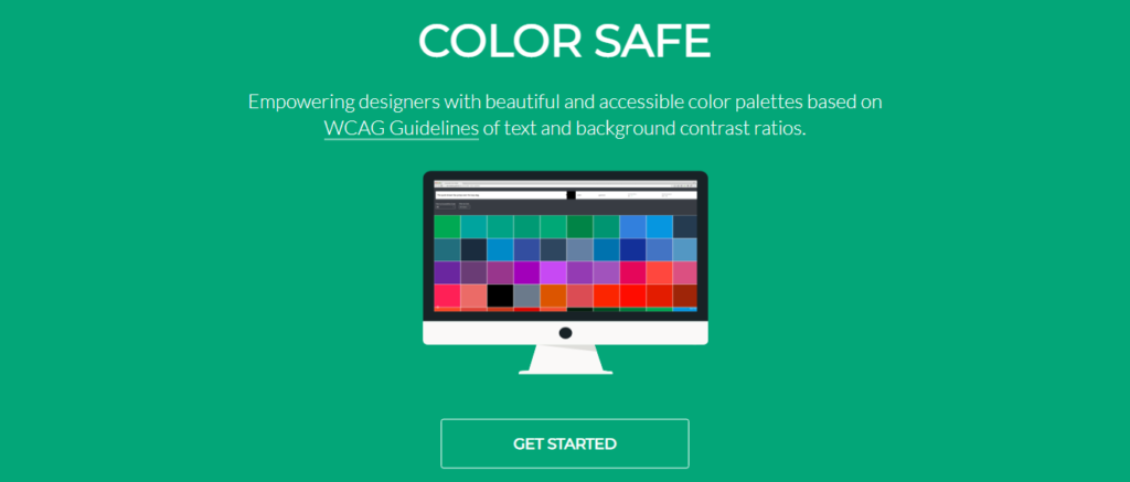
Color Safe is another service that allows you to generate and explore colors by type, enabling you to select the ideal red or green.
Color Safe
Once you’ve created a palette, you can submit your website to checkmycolors.com, which will analyze it and provide technical feedback on how effective your choice of color scheme is for people who are colorblind or have bad monitors.
Summary of How to Choose a Color for Your Website
When deciding on colors for your website, follow these steps:
- Select a primary color: Select a color that corresponds to the energy of your service or product.
- Choose your extra colors: Choose one or two complementary colors to your primary color, preferable ones that make the primary color “pop.”
- Pick a good background color: Select a color for your website’s backdrop that is less “aggressive” when compared to your primary color.
- Select a typeface color: Choose a color for the text that will appear on your website; keep in mind that a solid black typeface is uncommon and not recommended.
- And don’t be scared to use various web tools to locate your ideal color combination – there are lots to choose from!
Conclusion
Color is only one of many visual design aspects that every website designer should understand. Typography, layout, and user experience are also essential principles. And in order to put these ideas into action, you must first understand the strategy underlying web design.
Conducting strategy meetings with your clients can help you discover what challenges they are experiencing and what goals they are attempting to achieve; the key to high-quality web design is establishing measurable targets upfront and tackling real-world problems.

Leave a Reply